During the wireframing process, we produced ten iterations of designs in order to provide a complete yet comprehensible system. The first two preliminary wireframes proposed a system that supplemented the search feature by providing Recommendations and Top Picks by other users within the same window as the search feature. The next two iterations of an improved wireframes simplified the system and presented it in a more screen space efficient manner. The last five iterations of the final wireframes consisted of A Recommendation and Rating system that resides in a toolbar on the top right corner of the user's screen and uses little screen space to allow users to interact with the world while using the system.
Preliminary Wireframes
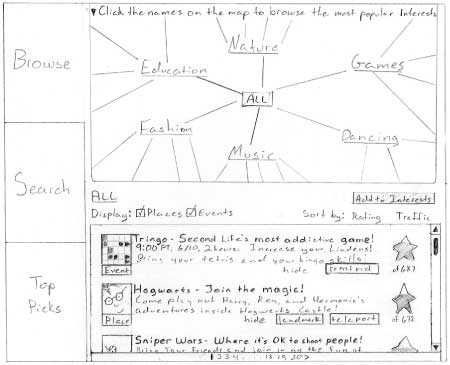
Through our user research, it was clear that the Search feature was the most used method of looking for things to do in Second Life by new users, yet it is overly complex and does not actively introduce the user to Second Life. We proposed the addition of Browse and Top Picks features to encourage users to explore the Second Life community. The Browse feature allows users to explore the content available in the Search feature without needing to have a specific goal in mind. This takes the mental load off of users and encourages them to discover new areas of Second Life. The Top Picks feature showcases favorite places, events, and groups by other Second Life Residents. This allows Residents to participate in building a repository of interesting places and connects users to each other.
We solicited feedback from our peers and our clients on this design. The main response we received was that the interface was very overwhelming, and the difference between the three sections was often misunderstood. Each screen was composed of a vast amount of text and buttons, causing the user to become lost in what to look at or interact with first. Lastly, our design occupied the same amount of space as the current search feature, which disallows users to interact with the world while they are using this system.
Improved Wireframes
Based on the feedback we received the on the preliminary designs, we focused on improving 3 things in the next two iterations:
- Provide a simple and compelling interface
- Allow users to feel more connected with the 3-D world while using the system
- Clearly distinguish between different features
Wireframes from the third design iteration
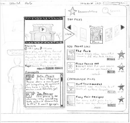
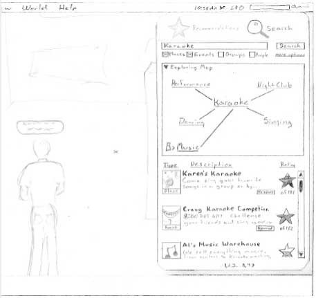
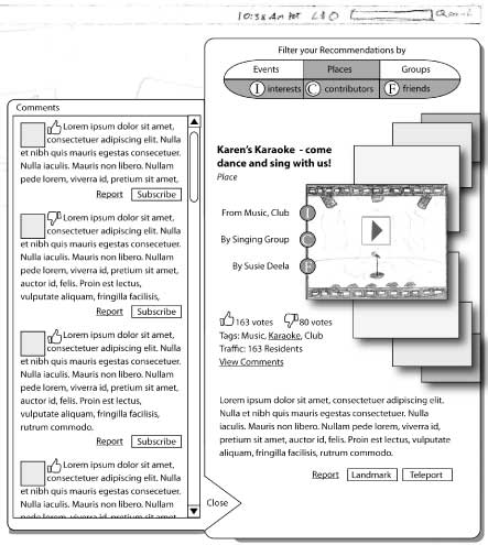
In the third iteration, users can toggle between the Recommendations and the Search features. In the Recommendations feature, Recommendation listings are separated into three categories: "Top Picks", "You Might Like" and "Contributor Picks". More detail about each recommendation in the listing can be brought up in a slide-out panel by clicking on the recommendation. In the Search feature, the Exploring Map is displayed as a collapsable pane. The presence of the Exploring Map takes the mental load off of the user by suggesting categories they can explore. When the user executes a search, the Exploring Map updates according to the user's search query.
We performed 13 Think Alouds using wireframes from the third iteration. We received feedback that it was not clear why Recommendations was separated into three sections, and limiting the lists to two recommendations per section was very frustrating. It was also easy to miss the "Recommendations" and "Search" tabs. The Exploring Map was still a concept that confused many of our peers and took up too much screen space.
Wireframes from the fourth design iteration
In this iteration we made further improvements to simplify the system and preserve screen space. The Recommendations component and the Search component have been completely separated to prevent confusion. In the Recommendations component, information is only displayed for the selected recommendation, while other recommendations in the list are represented by thumbnail pictures. We removed the Exploring Map because it was difficult to grasp. While browsing through search results, detailed information opens up in the main panel while a condensed list view is shown on its right. Comments slide out from the left of the panel.
While this design improved screen space efficiency by displaying only the most relevant information, we still felt everything was overwhelmingly condensed in small place. We decided to completely rethink the organization of information.
Final Wireframes
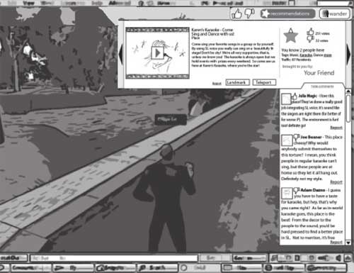
We set out to design a system that focuses on matching the content in Second Life to the individual's preferences by utilizing the combined knowledge of the community. In our previous iterations, we found that our designs were too complex and obscured too much of the world. Our final design is a Recommendations and Rating system that is accessible through a toolbar on the top right corner of the user's screen. The toolbar allows users to rate a place or event they are currently at, view the Recommendations window, or wander to a random Place. We found that using the top of the screen allowed us to display more information with less space, since the avatar resides at the bottom of the screen. Users needed to be able to cycle through multiple recommendations, while keeping the Recommendation window to a manageable size. After many iterations, we decided on toggleable List and Details views in the Recommendation window. Many kinds of information are available from the details view to establish the user's trust in the system, including comments by other users, which is a verticle dropdown from the Recommendation window. More details of the final system can be found on the Final Design page.